Connecting color and mood
As the weather gets warmer, the city welcomes a new color palette. Plants are blossoming, styles are shifting, and with the sun shining, once familiar territory suddenly has an entirely new glow. As I look out the window I see vibrant green leaves blowing in the wind, a pop of color against today’s grey sky. Despite the hustle and bustle, there's something relaxing in this view.
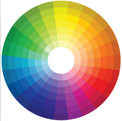
In art therapy, the use of color is often used to reflect mood, but did you know that color is also connected to emotion in our day-to-day environments? The colors you’re surrounded by- the paint you choose for your apartment, the new rug in your office, your new spring wardrobe- all influence your mood in different ways. Similarly, the color choices you make on a particular day may be a reflection of your mood at that given time. For example, some days you may feel like wearing something muted, other days you may be inclined to wear something bright. Start paying attention to how you’re feeling as you get dressed in the morning. How do people respond to you throughout the day? Cool colors (green, purple, blue) tend to be more relaxing and are linked to a mixture of emotions ranging from serenity to sadness. On the other hand, warm colors (orange, red, yellow) tend to be energizing and can trigger an array of emotions ranging from enthusiasm and love to irritation and anger.
Try this brief exercise to see how you react to different colors....
Materials: Box of crayons, white paper
Directions: Close your eyes and select a crayon. Set a timer for 2 minutes and create a monochromatic (using only 1 color) drawing. When done, write down the 1st 3-5 words that come to mind. How did drawing with this color make you feel? How did it affect your mood? Try the exercise again (as many times as you want!) with a different color. Notice the difference….
Below are some of the most common psychological effects of colors in the Western Hemisphere (www.arttherapyblog.com/online/color-psychology-psychologica-effects-of-colors). Feel free to compare/contrast your reactions with this list. Remember that shade, setting, culture, and personal associations all influence your relationship to color, so there is plenty of room for variation….
Color Psychology: The Color White
- purity
- innocence
- cleanliness
- sense of space
- neutrality
- mourning (in some cultures/societies)
Color Psychology: The Color Black
- authority
- power
- strength
- evil
- intelligence
- thinning / slimming
- death or mourning
Color Psychology: The Color Gray
- neutral
- timeless
- practical
Color Psychology: The Color Red
- love
- romance
- gentle
- warmth
- comfort
- energy
- excitement
- intensity
- life
- blood
Color Psychology: The Color Orange
- happy
- energetic
- excitement
- enthusiasm
- warmth
- wealth prosperity
- sophistication
- change
- stimulation
Color Psychology: The Color Yellow
- happiness
- laughter
- cheery
- warmth
- optimism
- hunger
- intensity
- frustration
- anger
- attention-getting
Color Psychology: The Color Green
- natural
- cool
- growth
- money
- health
- envy
- tranquility
- harmony
- calmness
- fertility
Color Psychology: The Color Blue
- calmness
- serenity
- cold
- uncaring
- wisdom
- loyalty
- truth
- focused
- un-appetizing
Color Psychology: The Color Purple
- royalty
- wealth
- sophistication
- wisdom
- exotic
- spiritual
- prosperity
- respect
- mystery
Color Psychology: The Color Brown
- reliability
- stability
- friendship
- sadness
- warmth
- comfort
- security
- natural
- organic
- mourning (in some cultures/societies)
Color Psychology: The Color Pink
- romance
- love
- gentle
- calming
- agitation